
OceansMap Insights
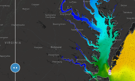
Navigation Chesapeake Bay
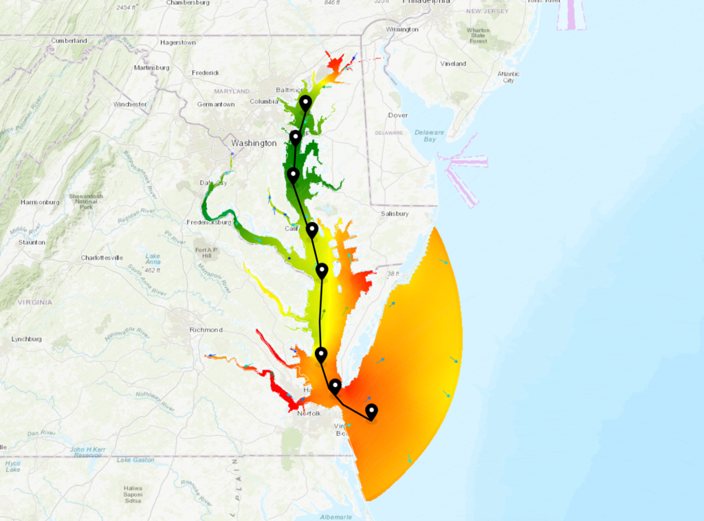
Map view showing the shipping channel through the Chesapeake Bay with virtual stations placed along the channel. Wind, water level, and currents are showing on the map with many more layers turned on, but with opacity set to 0. This way users can hover over an area with the hover tooltip tool on and immediately see all conditions at that location. Or they can click a virtual station to pull up the observation drawer.
Wind Farm Blade Inspection Acceptable Operational Conditions

Map view showing wind energy lease areas in the Atlantic with a layer highlighting the areas that are acceptable to perform blade inspection operations (waves less than 1.5m and wind less than 10 m/s at blade hub height). The Hudson Canyon lease area is selected, showing the windows in time blade inspection operations would be permittable. The permalink always opens to the current time.
East Coast Storm Tracking
Map view showing important data for tracking storms and assessing coastal risks. Wave height, winds, and surge tide predictions are loaded, as well as tropical cyclone outlook and active storms. Additionally, gliders and 2023 Hurricane Monitoring saildrones provide data at their locations and a virtual station at Elizabeth City, NC, is pre-loaded to display data in the timeseries.
Coastal Flood Watch Map
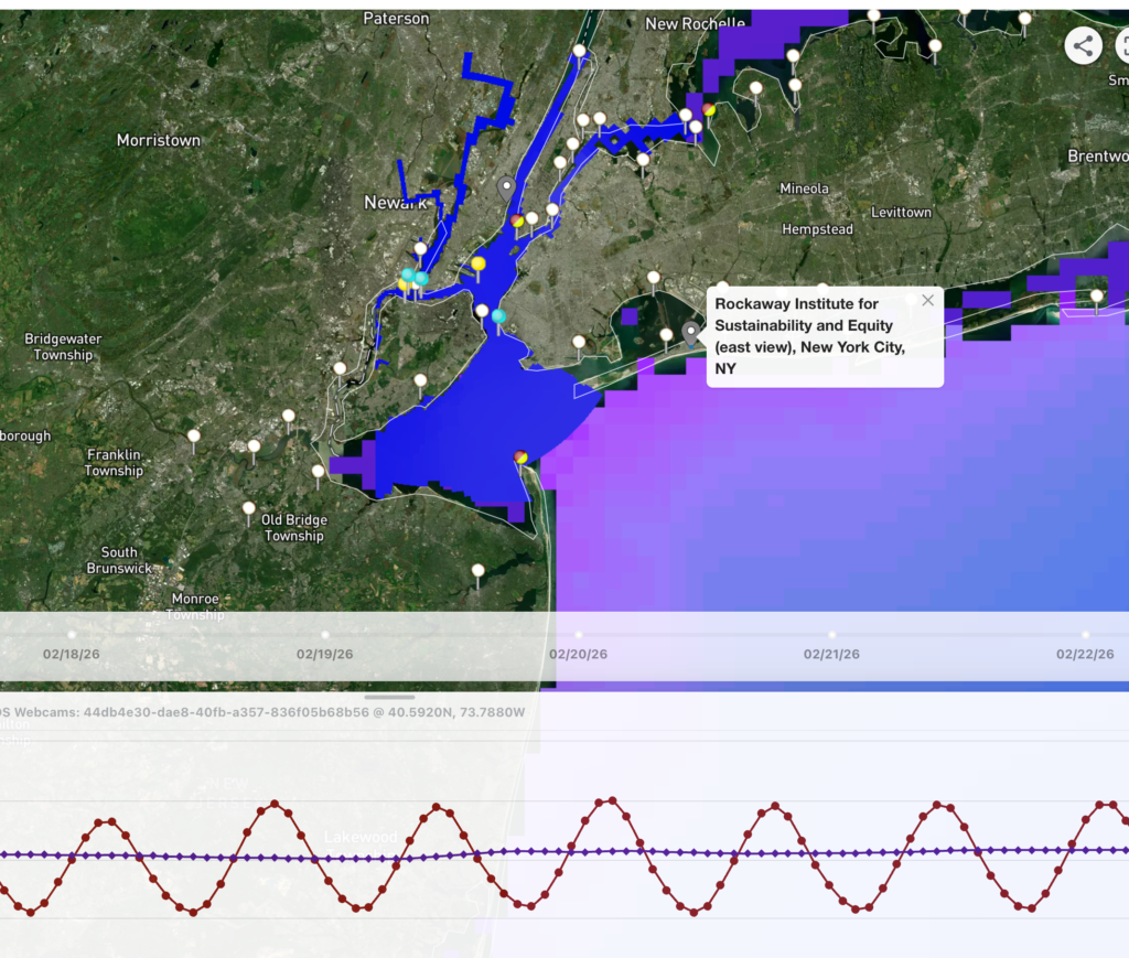
Map view highlighting the MARACOOS webcams in New York City, NY and Hoboken, NJ, which are situated to observe flooding in support of the WebCOOS project. Click the gray webcam station icon to load an image preview and select the preview to view the full-size image. The map also includes wave and water level prediction datasets, which can be compared against the webcam images, as well as CO-OPS water level stations to provide real-time in situ data.
Beachgoers Mid Atlantic Region
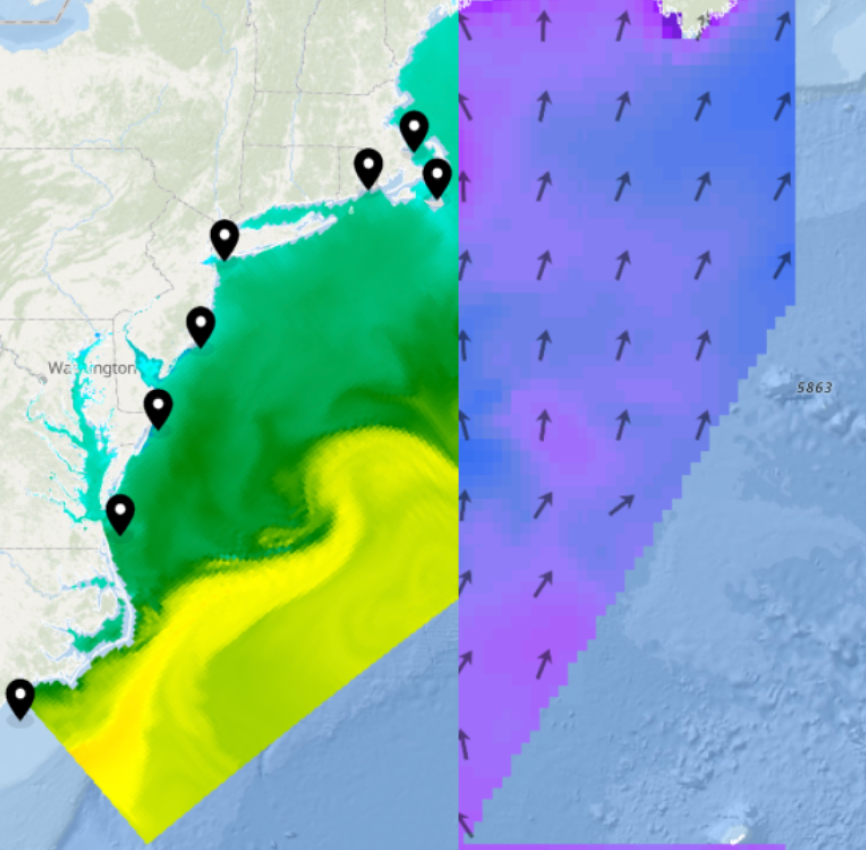
Map view using Compare Mode to view water temperature, as well as wave height and direction. Several Virtual Stations are also saved at key areas around the region to show key data in different areas. Click the Weather Window icon to view the Wave Height Decision Tool to determine if conditions are safe for beachgoers.
Boater Safety Long Island Sound

Map view highlighting live conditions (e.g., wave height and wind speed) at the Central Long Island Sound NDBC station. AIS vessel traffic data and shipping lanes are also loaded, while a layer on the map and in the timeseries plot indicates where and when wave heights are less than 1 m (green), above 2 m (red), or in between (yellow).
RI & MA Offshore Wind Developers Dashboard
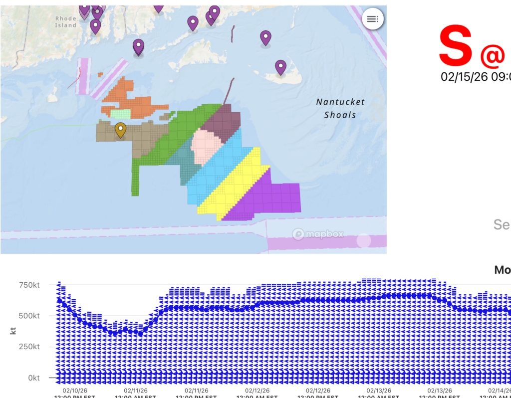
This dashboard highlights data that may be useful for offshore wind developers working in Rhode Island and Massachusetts Wind Energy Areas. Live conditions near the lease areas are provided, as well as forecasted information for winds, tides, waves, and currents. The Offshore Weather Window tool can support planning of offshore operations at the wind farm location.
Yearly Temperatures at Virginia Beach
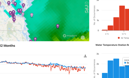
Overview of air and water temperature for the past 12 months at Virginia Beach Offshore, VA (171) (NDBC & Partner Stations: 44088) @ 36.6120N, 74.8380W. The values to the left give the current air and water temperatures at the station. The map to the right shows the location of the station (center) with model water temperature data showing on the map. The far right gives histograms of air and water temperature. Below is the time series plot for air and water temperature. And at the bottom is a time series plot of water temperature anomaly – times when the temperature reached below -0.5°C from the average are shown in green. Between -0.5°C and 0.5°C are in yellow. Above 0.5°C are in red.
Water Temperature Regional vs. Global Layer
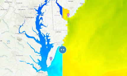
Compare mode showing the difference in resolution between a regional layer and a global layer. The resolution of a regional layer (NOAA Delaware Bay Water Temperature) clearly looks better at this zoom level vs. the global layer (NOAA GOFS 3D Temperature), which shows the importance of regional layers when interested in a specific point. The permalink will always open at the current time.
Water Temperature Anomaly

Map view of the mid-Atlantic region showing temperature comparison with the comparison slider tool turned on. On the left side of the map is the satellite measured MARACOOS AVHRR sea surface temperature 7-day composite. On the right side of the map is the sea surface temperature anomaly map showing the areas above and below the average temperature.
Water Level Research & Applications Planning Map

Map view displaying the planned locations for the installation of new water level sensors, as part of the MARACOOS IRA-funded Waves, Water Level and Webcams (WWW) project. Additionally, predicted water level and currents are visualized for the Chesapeake and Delaware Bays, highlighting existing data gaps and areas where models could be improved with the assimilation of real-time observed data in coastal areas.
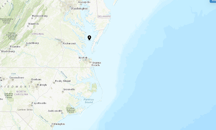
Virginia Beach Coastal Algae Risk Dashboard
A dashboard showing the probability of encountering HABs in Virginia Beach. Features also include physical characteristics, including predicted surface temperature, currents, winds and wave forecasts.
Gulf Stream Water Temperature and Current

Map view showing warm water moving north through the Atlantic via the Gulf Stream with global water temperature and currents layers activated.
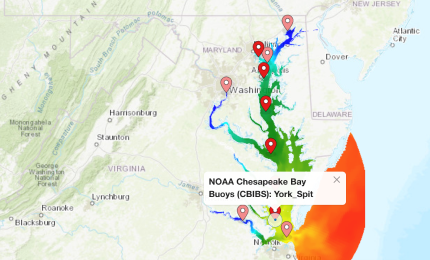
Detecting Chesapeake Bay Marine Heatwaves

A comparison of surface and bottom marine heat waves with surface and bottom 3D temperatures in the Chesapeake Bay. This Insight compares bottom temperature and bottom marine heatwave data (left side of the map) with surface temperature and surface heatwave data (right side of the map). As an example, users can explore data temporally by clicking the calendar and choosing “Past 30 days,” which should display the presence of a bottom heatwave in early October and which could be compared to the temperature data on the same time series plot.
Chesapeake Bay Salinity at Surface vs. Bottom
Compare mode showing salinity at the surface vs the bottom of the Chesapeake Bay. Areas with larger currents, like at the mouth of the bay, show the largest differences in salinity between the surface and bottom. The vertical profile plot gives the vertical salinity profile of the NOAA CBOFS 3D Salinity layer at the location of the Chesapeake Bay Buoys (CBIBS): First Landing @ 36.9983N, 76.0874W observation station. The time series plot in the bottom drawer compares the model layer data to the observed salinity levels for +/- 2 days.
Chesapeake Bay Salinity at Max Flood vs. Max Ebb
Map view with the compare mode tool on showing the interaction between the fresher bay water and saltier ocean water at max ebb (left) compared to max flood (right).
Chesapeake Bay 3D Salinity and Water Temperature
Map view showing the vertical profile plot of salinity and water temperature at a point in the middle of the Chesapeake Bay highlighting drastic changes in salinity and temperature. The sudden change in temperature seen in the vertical profile plot represents a thermocline.
Baltimore Coastal Algae Risk Dashboard

A dashboard showing the probability of encountering HABs along the Baltimore coast. Features also include physical characteristics, including predicted surface temperature, currents, winds and wave forecasts. In a Dashboard format, this Insight demonstrates how Chesapeake Bay Environmental Forecast System (CBEFS) datasets that indicate the probability of a HAB occurrence and the percent chance of encountering specific species (e.g., V. vulnificus, P. minimum, sea nettles) can be provided to users in the Baltimore area.
Block Island Station Dashboard
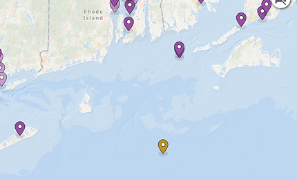
Historical data going back one month for the Block Island Station in a dashboard format. Explore wave height, wind speed and direction, water temperature, and current speed and direction from the past month at the Block Island CDIP Station. The 2-day forecast is also shown.